By Rob Fleming
It is a rare day, indeed, when Philadelphia gets a new art museum. Major buildings like the Barnes Foundation are like central characters in an unfolding drama of time and space within the civic heart of the city.
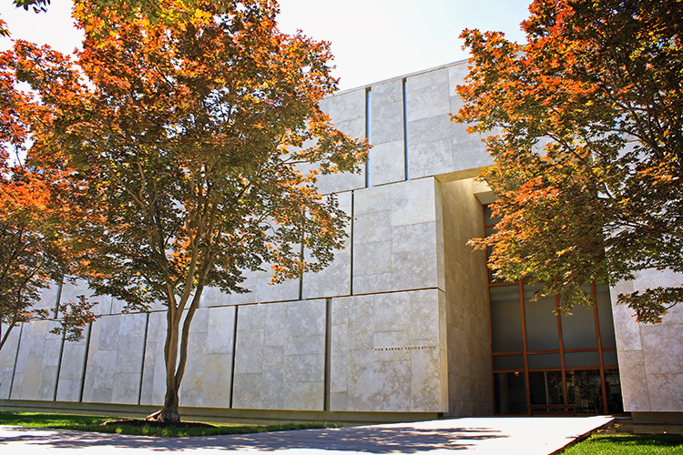
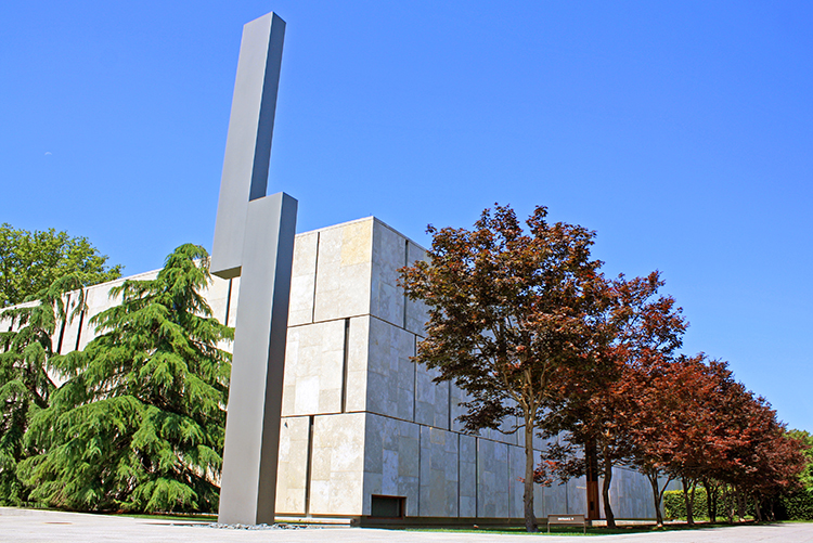
The Barnes is an architectural accomplishment to be sure. Its quiet dignity, serene landscapes and soaring spaces make it a true masterpiece—a hero to be sure. But like all heroes, the Barnes has its tragic flaw. Designed by Billie Tsien and Tod Williams and opened in 2012, the Barnes Foundation sits along the Benjamin Franklin Parkway, and therein lies the problem.
But first, let’s look at the highlights.
It might seem odd to start with the building’s performance, but in the early 21st century, a project that does not strive to meet the highest environmental standards possible is not worthy of the term masterpiece.
Thankfully, The Barnes is an example of authentic sustainable design.
Meeting LEED Platinum standards, the project is one of the greenest museums in the world. The integration of solar panels and a green roof are elegantly organized. The panels harness the sun’s energy for building use and the green roof helps to reduce the strain on the city’s combined sewer system. A large rainwater cistern stores all the water needed to flush toilets, and the lighting strategies combine artificial and natural light to perfectly illuminate the art while saving energy at the same time.
From an environmental point of view, the Barnes stands as an exemplar of how beautiful design and high-performance green buildings can peacefully coexist. Future high-profile projects built in the city have no excuse but to match or exceed the standards achieved by the project.
Now—about that fatal flaw…
Every building in the urban context has an important role to play in creating vibrant civic spaces. Sadly, the Barnes fails in this important social-cultural responsibility.
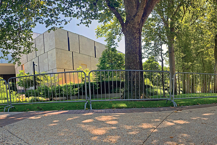
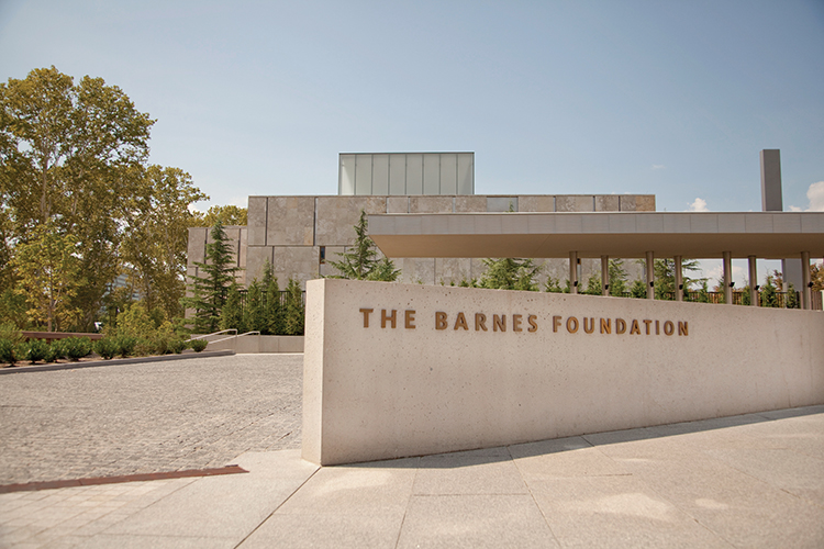
The facade facing the Parkway is relatively opaque, offering nary a glimpse into the magical world of art and architecture that lies behind. A dense shrubbery wall blocks views to a terrace that is accessible only to those who have “made it” into the museum. Sadly, the “closed” nature of the design speaks the language of exclusion. It ignores the lessons from the Pompidou Center in Paris, or the MET in New York, where broad architectural gestures engage the broader community and encourage everyone to “come in and enjoy the art.”
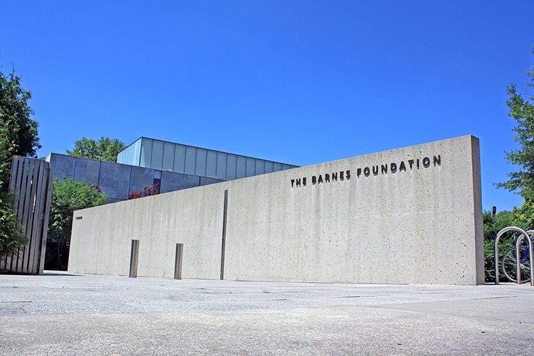
Even more disappointing is the actual entrance off the parkway. Where is it? A passerby might never know that the entrance to this amazing museum is down a wonderful pathway leading away from the parkway.
Lessons from its neighbor, the Rodin Museum, were ignored. That museum design managed to engage the parkway in both access and scale but retain the sense of quiet reflection in the entry sequence.
But here is the thing. It’s not too late to attack the fatal flaw of the building’s underwhelming urban response. The exclusive shrub-protected terrace can become an inclusive set of public steps on which citizens can sit and enjoy the parkway. The invisible pathway off the parkway can be punctuated by a new portico that encourages people from all walks of life to “come in and explore.” The “cantilevered corner” can be opened to the public and become the “Rocky Statue” for art and design lovers—a photo opportunity to be sure.
The Barnes can go beyond its leadership in environmental performance and its standing as a design masterpiece to become a true hero—a prominent player in the city’s long tradition of civically engaged architecture.


